

Branding
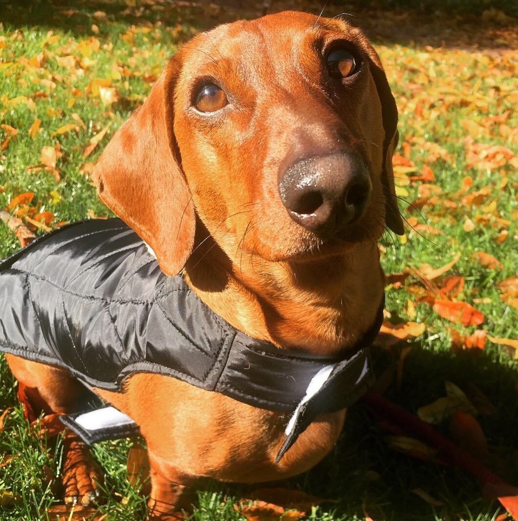
Longboi Media
Inspired by a ‘lil pooch and one’s love for film
This little logo here was designed with a little doggie in mind. Inspired by my client’s furbaby Dachshund, Longboi Media was cultivated using internet lingo and a fun whimsical icon to represent the cute hotdog-like build of such a puppy. I fetched iPad Pro in Procreate using the Apple Pencil, and I quickly drew up the image that immediately popped into my head, sent it over to Illustrator where I live traced the sketch, and paired it with a similarly playful typeface.

Alcohaul
Branding for a mail-in service delivering all of your boozey Faves straight to your door.
Specifically designed with you in mind, this fictional brand was concocted years before the COVID-19 pandemic graced our doorsteps. Alcohaul sounds exactly like what you think—it’s a monthly subscription service—all operated through an app and website—that would deliver your favorite wine, spirits and brews straight to you. The play on words, in AlcoHAUL drives home the fact that you don’t to do any of the physical hauling. There’s no leaving your couch, or venturing out into the cold, germ-y world, just unpacking and uncorking.
For easy, straight-forward and concise usability—the app offers a clean and simple UI that takes you where you need to go quickly. It helps you find what you’re looking for, and even gives you some suggestions of new things you’d might enjoy.

CM5k
Branding and motion graphic for fictional 5K color run

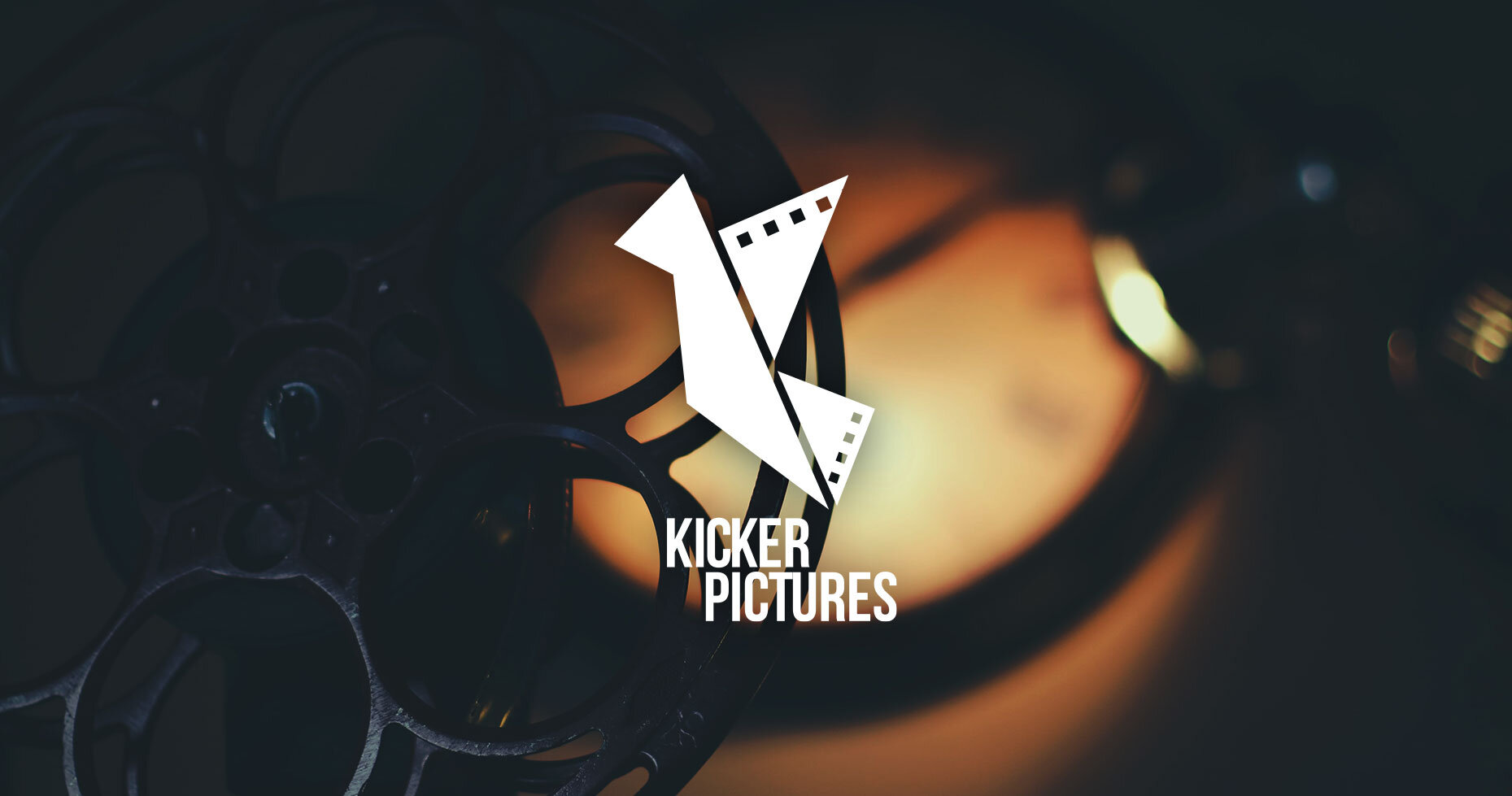
Kicker Pictures
logo concepts and final design for Kicker Pictures; a local film production company in Connecticut.